Brand Kit · 2026

Design
System

The complete visual language for GenZ4GTM — colors, icons, symbol grammar, and usage rules for every creative touchpoint.

01

Color Palette

9 brand colors across three tiers — primary, secondary, and background.

#FF4F9A
Vibrant Pink
Primary · Brand signature
#FFD93D
Bright Yellow
Primary · Energy & attention
#2B0B3F
Deep Purple
Primary · Authority & depth
#FF6B3D
Vibrant Orange
Secondary · Action & warmth
#00FDBB
Cyber Mint
Secondary · Tech & freshness
#FDADE1
Bubble Gum Pink
Secondary · Soft & playful
#F5F0E8
Smooth Cream
Secondary · Warmth & calm
#1E0A2E
Dark Purple
Background · Deep base
#113321
Dark Green
Background · Growth context
02

Color Logic

Each color has a defined role. Use these rules consistently across all creatives — posts, cards, UI, and print.

Vibrant Pink
#FF4F9A
  • Matching & PlacementMATCH, TOP KANDIDAT, VERBINDUNG — the core product action
  • CTA ButtonsPrimary actions: Apply now, See match, Connect
  • Post HeadlinesOpening line of social posts — grabs attention in feed
  • Decorative AccentsRHYTHM, SIGNAL — rhythm lines and broadcast elements
  • Brand SignatureLogo mark, 6-spoke asterisk, brand watermark
Bright Yellow
#FFD93D
  • Category LabelsSection headers in the icon system — yellow = label color
  • Highlight BadgesStar badges, featured tags, Top Kandidat markers
  • CROSS & PUNKT IconsFocus-point and close/remove actions in UI
  • Data CalloutsKey numbers, stats, and metrics in posts and reports
  • Symbol GrammarAsterisk variants — yellow = featured / spotlight
Deep Purple
#2B0B3F
  • Icon BackgroundsSTELLE FREI, GEN Z UPWARD, SPEED MATCH, MOTION, ELLIPSIS
  • Card BackgroundsContent cards, job listing tiles, profile cards
  • Text on LightBody copy and labels on cream or white backgrounds
  • Overlay PanelsModal backgrounds, tooltip panels, dropdown menus
  • Authority ContextsPartner announcements, company profiles, formal content
Vibrant Orange
#FF6B3D
  • HUMAN MATCH IconPeople-first matching — warmth and human connection
  • ECHO IconSignal / broadcast decorative element
  • Event & Partner LabelsPill tags for EVENTS and PARTNER categories in UI
  • Urgency SignalsDeadline soon, Limited spots, time-sensitive content
  • Warm Accent LinesDividers and decorative strokes in culture-focused posts
Cyber Mint
#00FDBB
  • Utility IconsAPPROVED, INSIGHTS, GROWTH, SAFE — system & verification
  • START-UP LAUNCH IconInnovation and ambition — the rocket/launch tile
  • SLASH DecorativeBold diagonal accent in the decorative system
  • Tech & Data ContextsGTM insights posts, analytics content, platform features
  • Success StatesConfirmation messages, match notifications, approved badges
Bubble Gum Pink
#FDADE1
  • CULTURAL VOICE IconSoft, expressive — visibility and voice in community
  • PLUS IconAdd / expand action — inviting and approachable
  • PARTNER Label TagPartner category pill in the icon context system
  • Community PostsSofter tone content — culture, wellbeing, community stories
  • Hover StatesHover/active state for pink interactive elements
Smooth Cream
#F5F0E8
  • MINDSET Icon BackgroundCalm, human — mindset-over-CV philosophy
  • Light Mode CardsCard backgrounds in light-theme contexts or print
  • Testimonial BlocksQuote cards, candidate stories, human-interest content
  • Whitespace SectionsBreathing room between high-energy color blocks
  • Print & PDFBackground for documents, pitch decks, one-pagers
Dark Purple
#1E0A2E
  • NEXT ORBIT IconDeep space — future-facing, orbital, ambitious
  • Page BackgroundPrimary background for all digital brand kit pages
  • Full-Bleed PostsDark-mode social posts — maximum contrast with pink/yellow
  • Navigation & HeadersSticky nav, section headers, app chrome
  • Video BackgroundsReel and story backgrounds — cinematic brand feel
Dark Green
#113321
  • GTM GROWTH IconGrowth chart tile — measuring and scaling GTM success
  • Growth & Revenue PostsContent about pipeline, revenue, GTM metrics
  • Success Story BackgroundsCase study cards, win announcements, placement results
  • Contrast PairingPairs with mint (#00FDBB) for tech-growth visual language
  • Seasonal CampaignsSpring/growth-themed content series
03

Icon System

26 icons across 5 categories. Consistent 2px stroke weight, 48×48 viewBox, rounded line caps throughout.

01 — Matching & Placement
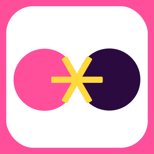
MATCH
MATCH Talent meets Job
STELLE FREI
STELLE FREI Open position waiting
TOP KANDIDAT
TOP KANDIDAT Featured candidate
VERBINDUNG
VERBINDUNG Talent & Company
02 — Future, Innovation & Speed
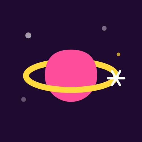
START-UP LAUNCH
START-UP LAUNCH Ambition & Drive
GEN Z UPWARD
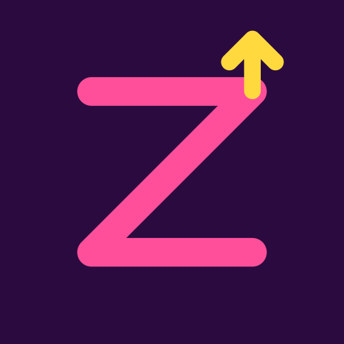
GEN Z UPWARD Rise & Generation
SPEED MATCH
SPEED MATCH Instant Placement
NEXT ORBIT
NEXT ORBIT What comes next
03 — Culture, Community & Identity
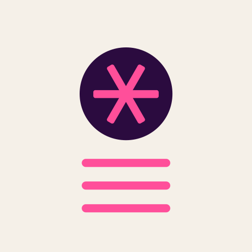
MINDSET
MINDSET Change starts here
CULTURAL VOICE
CULTURAL VOICE Amplify it
HUMAN MATCH
HUMAN MATCH People, not data
GTM GROWTH
GTM GROWTH Measure growth
04 — Utility & System
APPROVED
APPROVED System validation
INSIGHTS
INSIGHTS Data & analytics
GROWTH
GROWTH Scalability & performance
SAFE
SAFE Security & compliance
05 — Decorative Elements
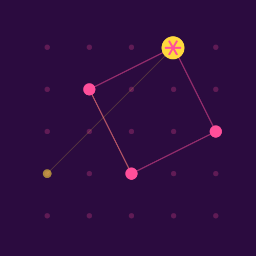
RHYTHM
RHYTHM Lines / structure
MOTION
MOTION Diagonal energy
PUNKT
PUNKT Focus point
ECHO
ECHO Signal / broadcast
SLASH
SLASH Bold diagonal
PROGRESS
PROGRESS L-shape / direction
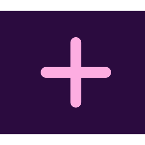
PLUS
PLUS Add / expand
SIGNAL
SIGNAL Broadcast / reach
CROSS
CROSS Remove / close
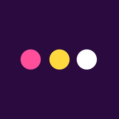
ELLIPSIS
ELLIPSIS More / options
04

Standalone Icons

Large-format single icons — Konstellation, Frequenz, and Horizont. Each is a self-contained composition designed for hero use, social posts, and full-bleed placements.

Konstellation & Frequenz
KONSTELLATION
KONSTELLATION Network of connections
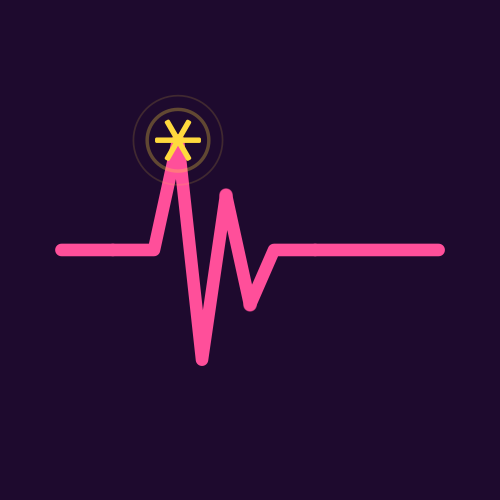
FREQUENZ
FREQUENZ Signal & rhythm
Horizont — Wide Format
HORIZONT
HORIZONT Panoramic / wide-format placement
05

Freistehende Elemente

Decorative standalone elements — used as texture, dividers, and accent marks in layouts. Five large elements and six compact bar variants.

Large Decorative Elements

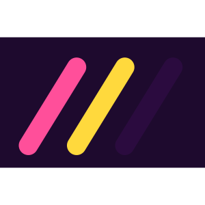
SLASH TRIO
SLASH TRIO 3 diagonal lines
RHYTHM
RHYTHM 3 horizontal lines
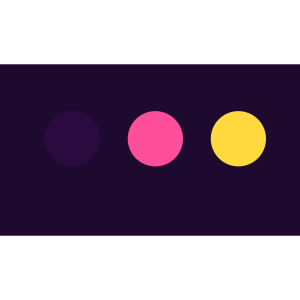
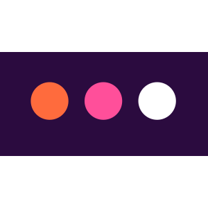
ELLIPSIS
ELLIPSIS 3 dots
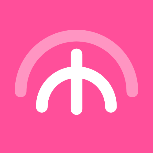
ECHO
ECHO Arc / broadcast
CROSS
CROSS X mark
Bar Variants — Small Scale
BAR CROSS
BAR CROSS Close / cancel
BAR RHYTHM
BAR RHYTHM Menu / lines
BAR ELLIPSIS
BAR ELLIPSIS More options
BAR ECHO
BAR ECHO Arc / broadcast
BAR SLASH
BAR SLASH Diagonal line
BAR PLUS
BAR PLUS Add / expand
Bar Variants — Combined Toolbar
All 6 bar variants in a single toolbar pill: Cross · Rhythm · Ellipsis · Echo · Slash · Plus
06

Icon in Context

How icons appear inside product UI — cards, tags, and grammar bars.

UI Cards
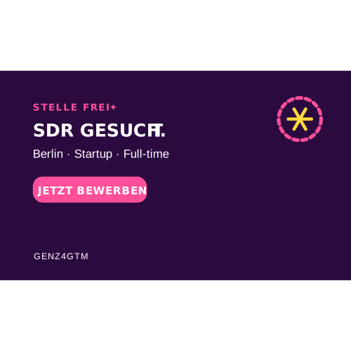
STELLE FREI Card
STELLE FREI — Card Open position UI card with label tag
TOP KANDIDAT Card
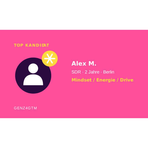
TOP KANDIDAT — Card Featured candidate card with badge
Symbol Grammar
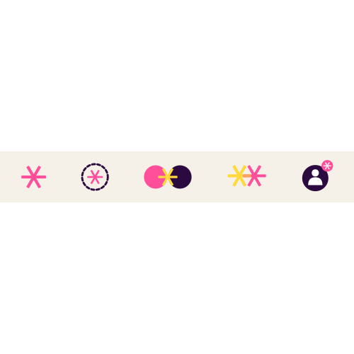
Symbol Grammar Bar
Star Alone
= Visibility / spotlight. Marks featured candidates, top profiles, or highlighted content.
Ring + Star
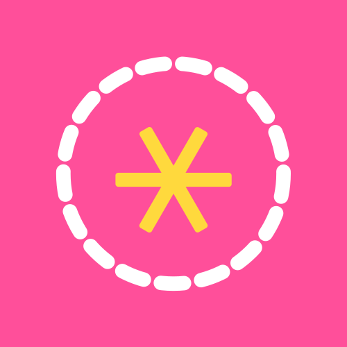
= Open position. A vacancy waiting to be filled — used in job listing contexts.
Two Circles + Star
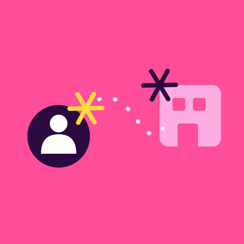
= Match made. Two profiles (talent + company) connected — the core product outcome.
Two Stars
= Match confirmed. Double star signals a successful, mutual match between both parties.
Star Badge
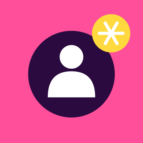
= Top Kandidat. The badge variant marks a vetted, high-quality candidate in the platform.
6-Spoke Asterisk
= Brand mark. The GenZ4GTM logo symbol — never substitute with a 5-point star.
07

Typography

Two typefaces — ARGANDIR Bold for display & headlines, Poppins for body, labels, and UI text.

Display
ARGANDIR Bold
700 · uppercase
48–96px
GenZ4GTM
Heading
ARGANDIR Bold
700 · uppercase
24–36px
Talent meets opportunity.
Body
Poppins Regular
400 · 0em
14–16px
We connect Gen Z sales talent with the companies building the next generation of GTM teams. Mindset over CV — always.
Label / UI
Poppins SemiBold
600 · 0.15em
10–12px
GENZ4GTM · BRAND KIT · 2026